Well it arrived last week and so far I've been nothing but impressed - 10/10!
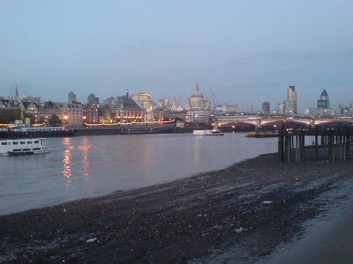
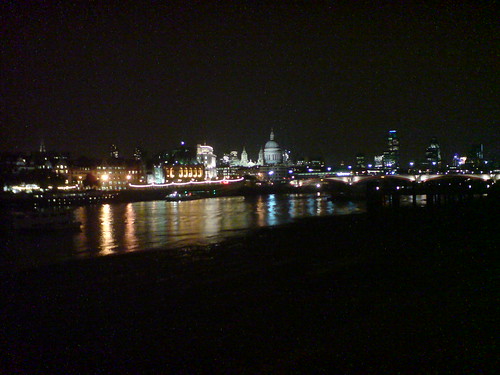
I've also fairly recently moved home and thus my old commute to Canon Street is no more! I now (if I walk) get to go past tourist attractions such as St Pauls, Blackfriars Bridge and down towards Waterloo (where the internationally famous London Eye stands tall). During this walk I took some photos with my 'old' k800i and was reasonably impressed with them (factoring in that it is primarily a phone). After getting my new k850i I decided to walk the route again and take some more shots - a like-for-like comparison!
Before we go anywhere - I am stunned. In fact, I am always stunned how much technology progresses in just 1 year (a mere thirty one and a half million seconds!). Now for the comparison - to start with I will link you to my flickr profile where I've put the original k800i photo's...
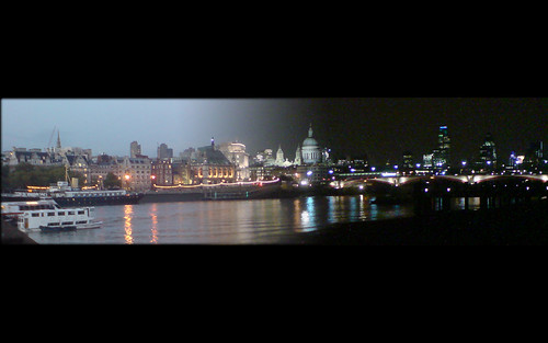
The third image is a composite transition I created fading the day/dusk shot to a night shot. I'm rather please with that effect!
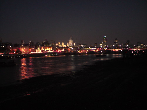
Ok - now for the comparison... The k850i! Unfortunately, due to leaving work at 5:30 its pretty much dark when I leave, let alone when I actually make it to the Waterloo area so getting a daylight shot is proving much harder than anticipated... But in any case, here is a night shot from my k850i.
As you can see (especially if you navigate to the full sized versions of both night shots) the k850i is MUCH better in dark conditions.
Apart from the camera there is a lot about the k850i that you'll find familiar with the k800i. The biggest changes that I've found are as follows:
-
The music interface has taken a revamp - MUCH better to navigate now. The phone actually acts like a proper MP3 player, allowing browsing my artist, album, etc in a much more usable form.
-
Photo navigation has been revamped to a new interface. Much nicer to use. Biggest change is probably the zoom. You're no longer locked to 1x, 1.2x, 1.5x, 2x and 4x (or something like that). Its MUCH more granular. Also when you zoom and scroll around the photo the camera switches to a kind of 'draft' mode and then does a kind of final render of the portion after a second or so. Nice touch! Oh yeah, the orientation of the camera is automatially determined by the angle you hold it at (portrait/landscape).
-
Menu tweaks - Alarm Clock is on the frontpage rather than hidden away under Organizer. There is a new feature allowing the phone to be a Torch (this is on my quick links now!) Its a pretty handy feature than one of my old Nokias had and then the feature disappeared for several years of all phones - now it seems to be back?!
-
Phone as a device... They've got rid of the nipple/joystick (THANK GOD!). The nipple always used to last a few months then start acting up (like you'd temporarily lose the ability to go left or something). This happened on my k800i and my friends k800i too (as well as my old k750i). Now its a set of kind buttons surrounding the 2 and 5 keys. This takes some getting used to! Another thing to get used to is there is no top left/right button anymore. Instead there are light (?) sensitive buttons at the bottom of the screen. When I first saw these I thought "Oh god, over-engineered!" however I've come to realize it makes PERFECT sense! Those buttons are the 2/3 most used on the phone - why not make them out of a device which one wear out due to usage?! Cunning!
-
SIM Card, Memory Card and battery. These no longer assemble like a game of Tetris under a back cover. Instead you slide the base outwards (although the hinge feels rather weak) and you have 2 separate slots for the battery, SIM & memory card. Nice touch - if it lasts!
I think that about covers it for now... I'd really like to know what other people's experience of this phone is and if they've found any cool resources. I'll be posting up about any themes and stuff I find for it!
Hope you enjoyed the review!
